Making images response for website optimization
In today's world, mobile devices are becoming the primary medium for browsing the internet, and users are demanding faster load times more than ever before. In order to cater to this growing demand, websites need to ensure that their images are responsive and optimized for different screen sizes. Responsive images not only enhance the user experience but also play a vital role in improving website performance and search engine optimization (SEO).
To help you achieve the perfect responsive images for your website, we've put together a comprehensive guide that covers our strategy for optimizing website's images. We discuss our approach to breakpoints, which your images should adjust, and a possible solution for deploying an responsive website with HTML5. By implementing this strategy, you can ensure that your website's images are perfectly suited for all devices, leading to faster load times and improved SEO.
Defining the breakpoints and image sizes
To improve website performance and reduce costs, adjusting image size is often the best option. By resizing images to a lower resolution, we can reduce the number of pixels and file size, resulting in significant improvements in web KPIs and savings on CDN bills. By revising and adjusting image breakpoints, we can optimize the speed of our website.
Ideally, we want to deliver images with resolutions that fit the display size in real pixels, not virtual size. To achieve fast loading times, we should take advantage of our CDN cache and use a limited number of well-chosen breakpoints. On-the-fly image processing can incur latency and result in an uneven allocation of CDN cache, which can lead to an inconsistent user experience.
By analyzing the layout of our front-ends and the characteristics of our users' devices, we can easily propose the best breakpoints. Mobile devices generate higher traffic volume and are exposed to adverse network conditions, making optimization especially important for mobile users. By examining typical ecommerce layouts, we can cover the most frequent uses of images on our website.
For mobile users, we can estimate the statistics of displaying widths based on device characteristics. Navigation on mobile devices is less flexible compared to desktop, so mobile layouts tend to be more repetitive in how they use images, typically in full or half-width. This makes the displaying size of images more predictable on mobile devices than on desktop.
Looking at the display sizes of popular mobile devices, we can determine likely image widths. The majority of iPhone models have a resolution of 750x1334, while X models have a resolution of 1125x2436. On Android, most models have either a HD (720x1280) or full HD (1080x1920) display. Some models also have a 2K resolution display (1440x2960).
Here's a table summarizing the most common display resolutions on popular mobile devices:
| Device Type | Display Resolution | Likely Image Width |
|---|---|---|
| iPhone | 750x1334 | 375, 750 |
| iPhone X | 1125x2436 | 563, 1125 |
| Android HD | 720x1280 | 360, 720 |
| Android FHD | 1080x1920 | 540, 1080 |
| Android 2K | 1440x2960 | 720, 1440 |
For mobile devices, we can simplify the list of breakpoints by combining cases that are close, such as the 563 and 540 pixel widths. This results in a list of likely-to-occur image displaying widths: 360, 375, 540, 563, 720, 1080, 1125, and 1440.
We can also add some common desktop display sizes, such as 1024, 1280, and 1920 pixels, as well as larger sizes for zoom images and smaller sizes for shopping cart thumbnails. The choice of breakpoints ultimately depends on our website layout and our users' devices.
Using the responsive images in HTML5
One way to make images responsive on the web is by using the HTML5 <img> tag and its features, such as the
srcset and sizes attributes. The srcset attribute allows you to specify a number of image asset variants for different pixel
densities and viewport sizes, while the sizes attribute tells the browser about image sizes for different breakpoints.
You can easily create your image variants with Abraia and configure your website with standard HTML5 for use all these derivatives. Here's an example of how to use the srcset and sizes attributes to make images responsive:
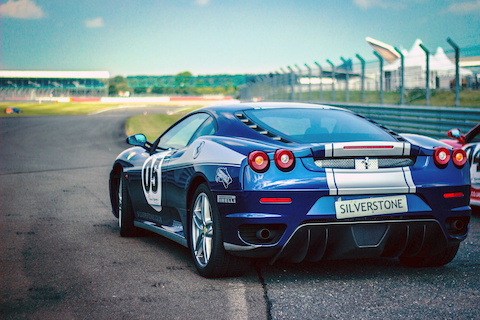
<img src="https://abraia.me/images/racecar_w480.jpg?w=480"
     sizes="(min-width: 36em) 600px, 100vw"
    srcset="https://abraia.me/images/racecar_w100.jpg 100w,
            https://abraia.me/images/racecar_w240.jpg 240w,
            https://abraia.me/images/racecar_w480.jpg 480w,
            https://abraia.me/images/racecar_w640.jpg 640w">
In this example, the sizes attribute specifies that the image should be rendered at 600 pixels width if the viewport is wider than 36em, and the entire viewport otherwise. The srcset attribute specifies four different image variants with different widths, and the browser selects the best-fitting image based on the available space.
While specifying a range of image asset variants is an effective way to deliver responsive images, it can be challenging to create and manage the variants themselves. With tools like Abraia, you can automate the generation of image variants from the original image, ensuring they look good and have a small enough footprint to improve website performance.